Summary:
Created Censeo as a mobile app and marketing site to streamline the mental health referral process, improving the user experience to reduce patient frustration and boost completion rates. This approach helps GPs save time and resources.
My role:
Product Designer
Contributions:
- + User Experience
- + Visual Design
- + User testing/research
- + Mobile first design
- + Design systems
- + Style-guide creation
Team:
- + Myself
- + 1 Product Manager
- + 1 Researcher
- + 2 Front-end engineers
- + 2 Back-end engineers
Overview
In a 12-week project, I served as the product designer, leading various tasks including:
- + Conducting user interviews and competitor analysis
- + Managing stakeholders expectations
- + Developing a style and brand guide
- + Developing UI elements, visual assets, and interaction designs for mobile first
Problem
Censeo is a digital triage process that aims to help GP’s by referring patients suffering mental health issues to use their online assessment. Increasingly a large number of patients have been referred but often find the process difficult to use as the current site is not fit for purpose. This situation causes frustration for patients and ultimately means that they are not completing the triage process which costs the GP’s money and results in patients looping back and forth in the NHS system.
User and Business Goals
- + Create a simplified, user-friendly triage experience.
- + Provide easy access to mental health resources.
- + Streamline the triage process for faster, efficient care.
- + Ensure mobile-friendly design for on-the-go users.
- + Deliver clear guidance and support throughout the process.
Outcomes
- + Triage completion improved by 22% with streamlined processes.
- + Site performance enhanced with 2.3-second load times, reducing bounce rates.
- + Redesigned pages increased engagement and satisfaction by 25%.
- + Mobile traffic grew by 34% due to optimized responsiveness.
- + SEO improvements increased organic traffic by 18%.


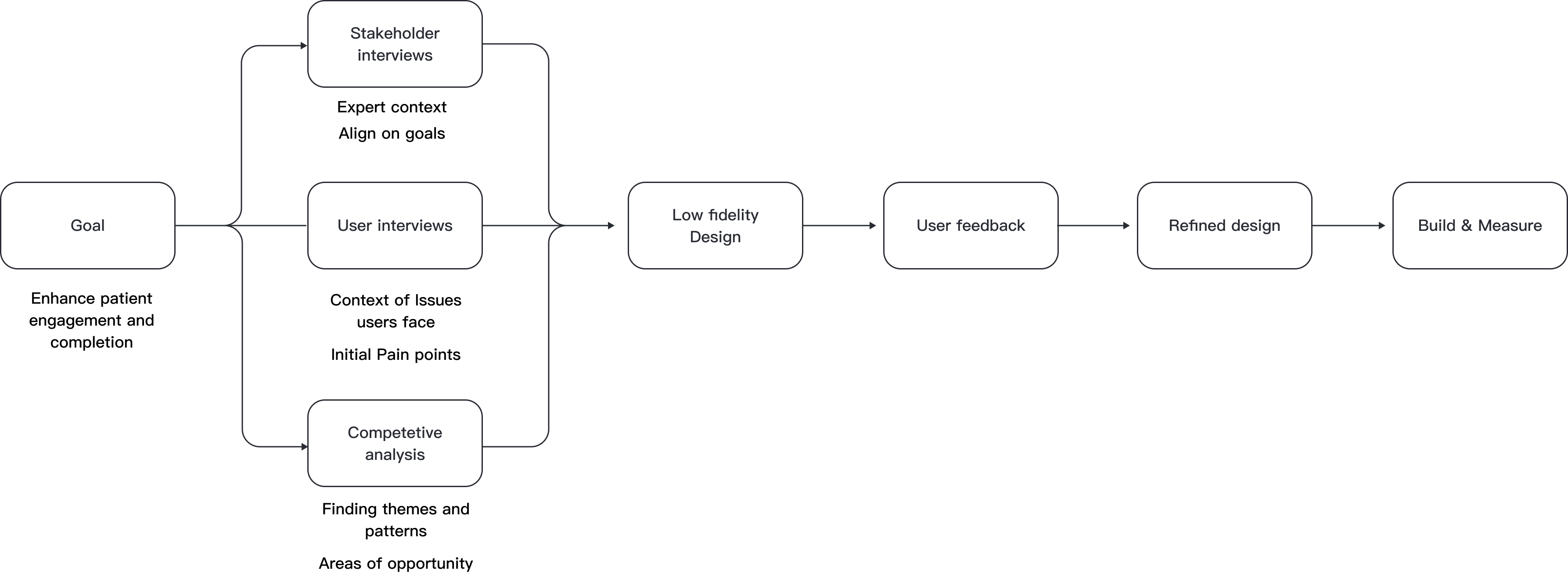
The process of problem solving

Stakeholder interviews were conducted to understand the problem space, identify user pain points, and define the overall process. This helped establish KPIs aligned with the brand system and provided a foundation for research. It also clarified business needs, client goals, and the current state of the project.
User interviews:
We used insights from stakeholder interviews to define the key user groups, which guided us in sourcing the right participants for user interviews. This approach helped ensure we were engaging with the correct users and allowed us to better understand the challenges they face when using the site and seeking help.
Key Insights:
After speaking with stakeholders and identifying indirect competitors, we conducted a competitive analysis and benchmarking. This helped us understand current offerings, identify gaps in Censeo, and find opportunities to provide additional value. Although not direct competitors, these sites were relevant as they offered similar medical services in different contexts.
Thought process
After conducting initial research and gathering context, we defined the problem, scoped out user pain points, and clarified the problem space. We then set clear objectives and established success metrics, ensured alignment with stakeholders, and developed user scenarios.
User personas:
Personas are not always necessary due to frequent user interactions and involvement from teams like Sales and Customer Success. In agency work, it was crucial to align as a team and with key stakeholders to ensure everyone was on the same page regarding user understanding and goals.
.png)
- Name: Che
- Risk: Low
- Age: 21
- Occupation: Apprentice
Che spends a lot of time socialising with friends and being outside. He works hard as an apprentice and is aiming for the next step in his career. During the last year he has seen an increasing rise in his anxiety during lock-down which has led to depression. He feels it is becoming a problem in his life but does not feel it is worth visiting a GP over.
.png)
- Name: Kate
- Risk: Moderate
- Age: 34
- Occupation: Office manager
Kate has been working as an office manager for the last 3 years. She works in a high pressure environment and can find that she often has severe episodes which can cause he to become reclusive as well as limit her communication. She wants to find support for her conditions but has had negative experiences in the past and finds it difficult to discuss her condition with others.
.png)
- Name: Stefan
- Behind the scenes GP
- Age: 41
Stefan has worked as a GP for the last 7 years. He is an active person who enjoys being outside and speaking with different people every day. He enjoys his work and has become increasinglyfrustrated by the amount of people being let down by the system. he wants to help but has a limited amount of time in the day and with a rise in the number of patients, is being overwhelmed.
Pain points:
Patients: Sub-clinical
- Uncertainty About Need for Help: They are unsure about whether their symptoms
require professional support.
- Reluctance to Seek In-Person Help: Fear of wasting time or judgment prevents them
from visiting a GP.
- Need for Validation: They seek validation and confirmation that their concerns
are legitimate.
- Reassurance of Value: They require assurance that the process will be beneficial
and worth their time.
- Clear Information on Support: They need clear guidance on available support
options and resources.
Moderate to Severe
- Reluctance to Speak to a GP: Hesitance to engage with a GP, particularly in
cases of depression or anxiety.
- Impact on Daily Life: Their conditions significantly affect their daily life and
functioning.
- Confusion About Next Steps: Uncertainty about where to seek help and how to
navigate the process.
- Need for Comprehensive Assessment: They require reassurance that the process
will provide a thorough assessment and direct them to appropriate support.
Complex
- Previous Negative Experiences: They may have had extensive support in the past
with unsatisfactory outcomes.
- Feelings of Hopelessness: They might feel that no intervention will make a
difference, leading to skepticism.
- Difficulty Completing Assessments: Struggles with completing the assessment
process due to past experiences or current conditions.
Thought process
Having initially dived into the problem by speaking to
customer success and other key stakeholders and also speaking to users who had
reached out we decided to perform usability studies of the current platform to give greater
context to the issues both reported and get a more developed idea of where the current
flows were lacking and the areas of opportunity. This proved useful as we discovered
insights that meant we were confident to proceed.
Thought process
Having initially dived into the problem by speaking to customer success and other key stakeholders and also speaking to users who had reached out we decided to perform usability studies of the current platform to give greater context to the issues both reported and get a more developed idea of where the current flows were lacking and the areas of opportunity. This proved useful as we discovered insights that meant we were confident to proceed.
Information Architecture:
I began by outlining the overall structure of both the website and the app, defining key areas and establishing a clear framework for each. This initial step was crucial in ensuring that all team members and stakeholders had a shared understanding of the project's architecture. By mapping out the main components and their interrelationships, we were able to create a cohesive plan that guided subsequent development phases.
Information Architecture - Censeo Marketing Site Phase 1
Information Architecture - Censeo Marketing Site Phase 2
Censeo Mobile App - Additional Pages
After refining the architecture of the site and app, I focused on clarifying the key user flow—the assessment process. This is crucial because it's how users get value from the app, and it involves sensitive subject matter. I made sure to understand the context and gather input from stakeholders to ensure the process was clear, respectful, and well-integrated into the overall design.
Censeo Mobile App - Core flow
Thought process
Having refined the structure and the key flow helped me to break the flows into managable steps and frames. This meant that we could go through the proposed structure define the core features for each flow and then list requirements for each frame.
I followed the steps below in the design phase:
- 1. Paper Sketches
- 2. Low-fidelity wireframes with variations (Discussion with engineering)
- 3. Hi-fidelity design
Marketing site - Wireframes
Mobile App - Wireframes
Thought process
Wireframes helped me align with all the stakeholders and
as a team we could then break
the site into manageable chunks in order to then build out each flow. We
proposed phases - splitting the marketing site
into phase 1 and 2 with the mobile application to follow on.
We chose to focus on internal testing with stakeholders at this
stage because it allowed us to quickly validate the wireframes with key
decision-makers and ensure alignment with business goals. Given the project
timeline,
this was the most efficient way to move forward while still ensuring the
design met our initial objectives.
Refining the Hi-fidleity designs
We overhauled the flow and produced a simple step process in order to help simplify the process by taking the three campaigns and putting them into separate flows as well as offering more context on what each does - this was also supplemented by introducing supplementary pages.
Marketing site Hi-fidelity designs:
Website Results
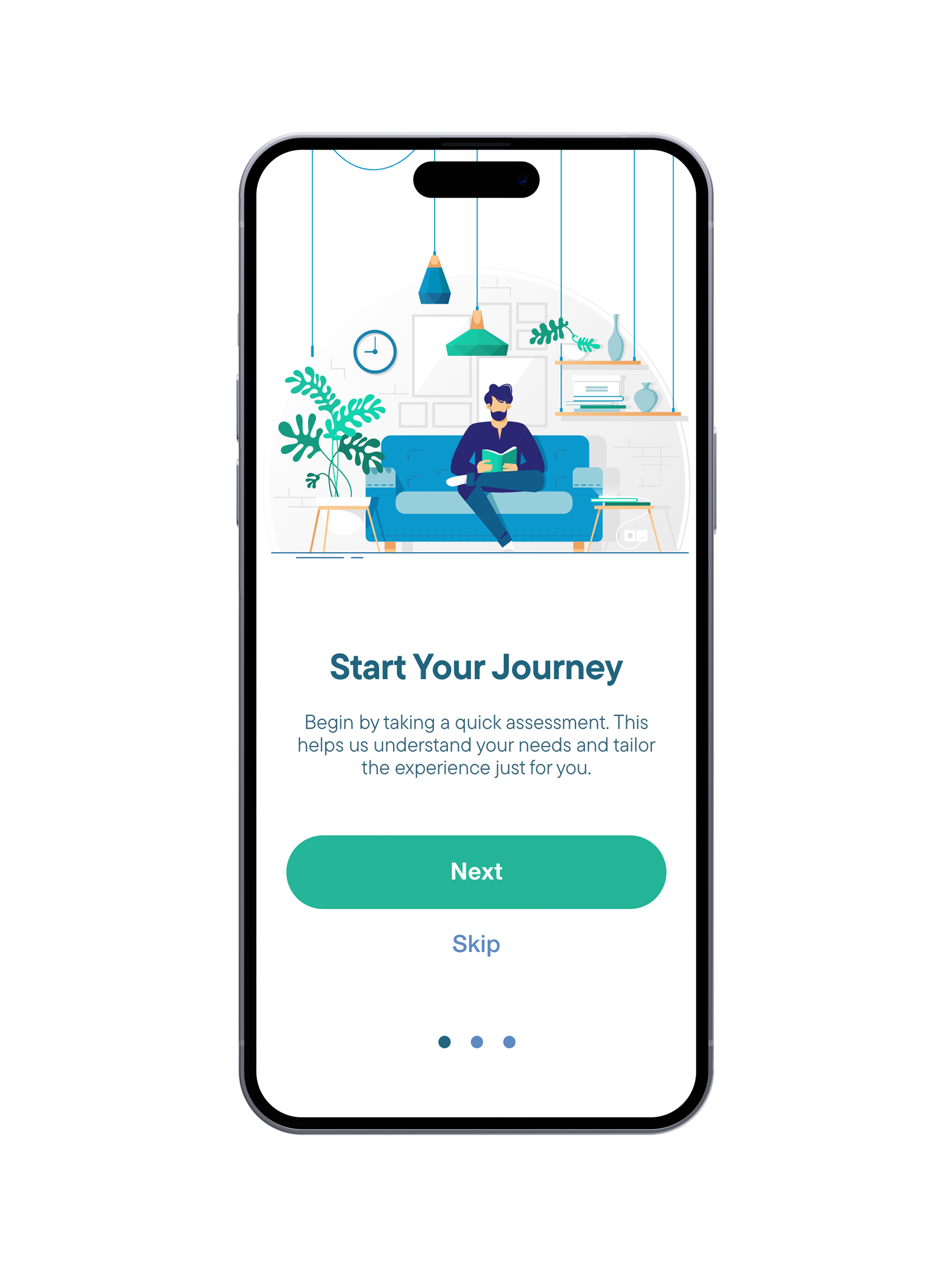
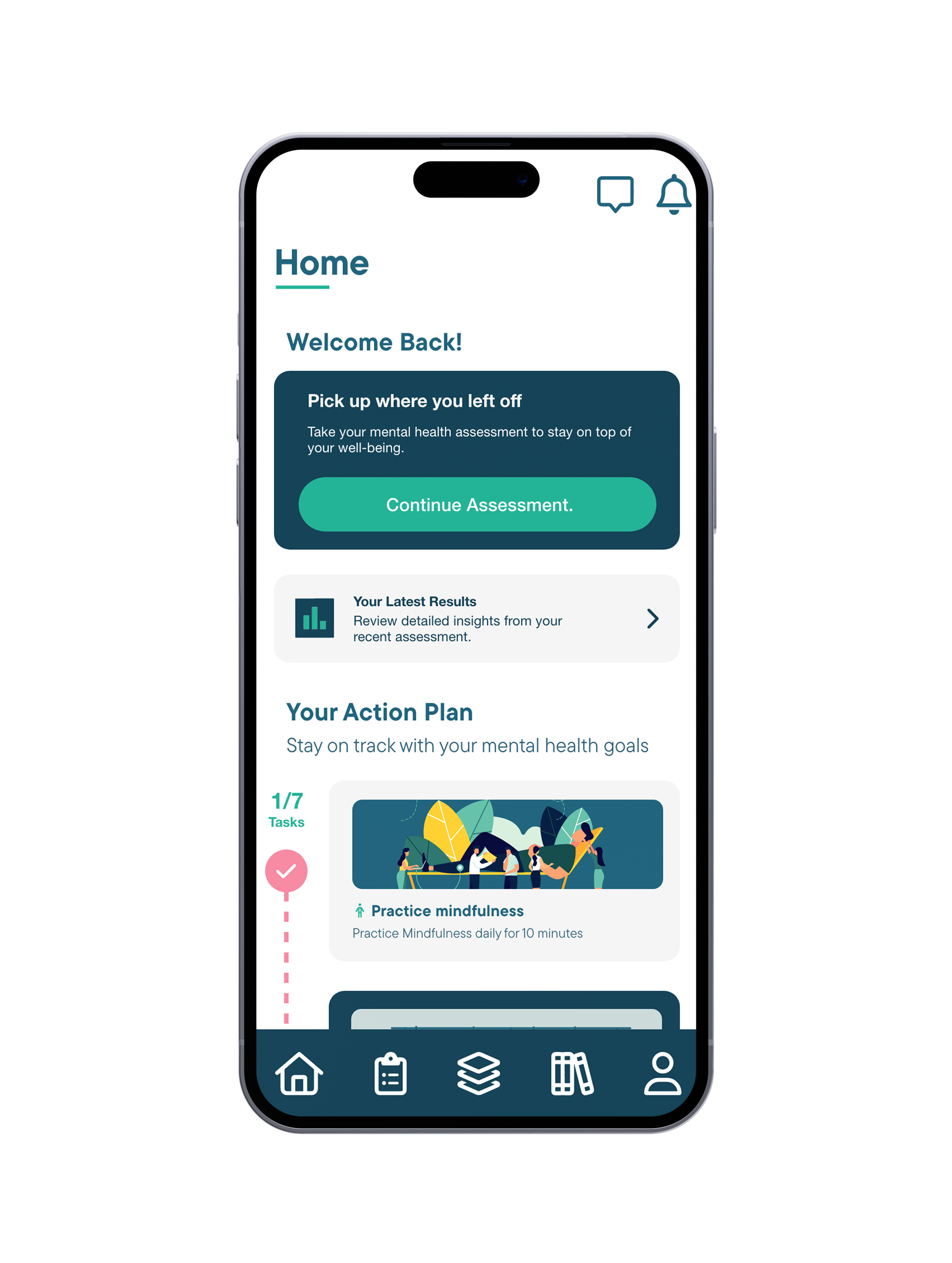
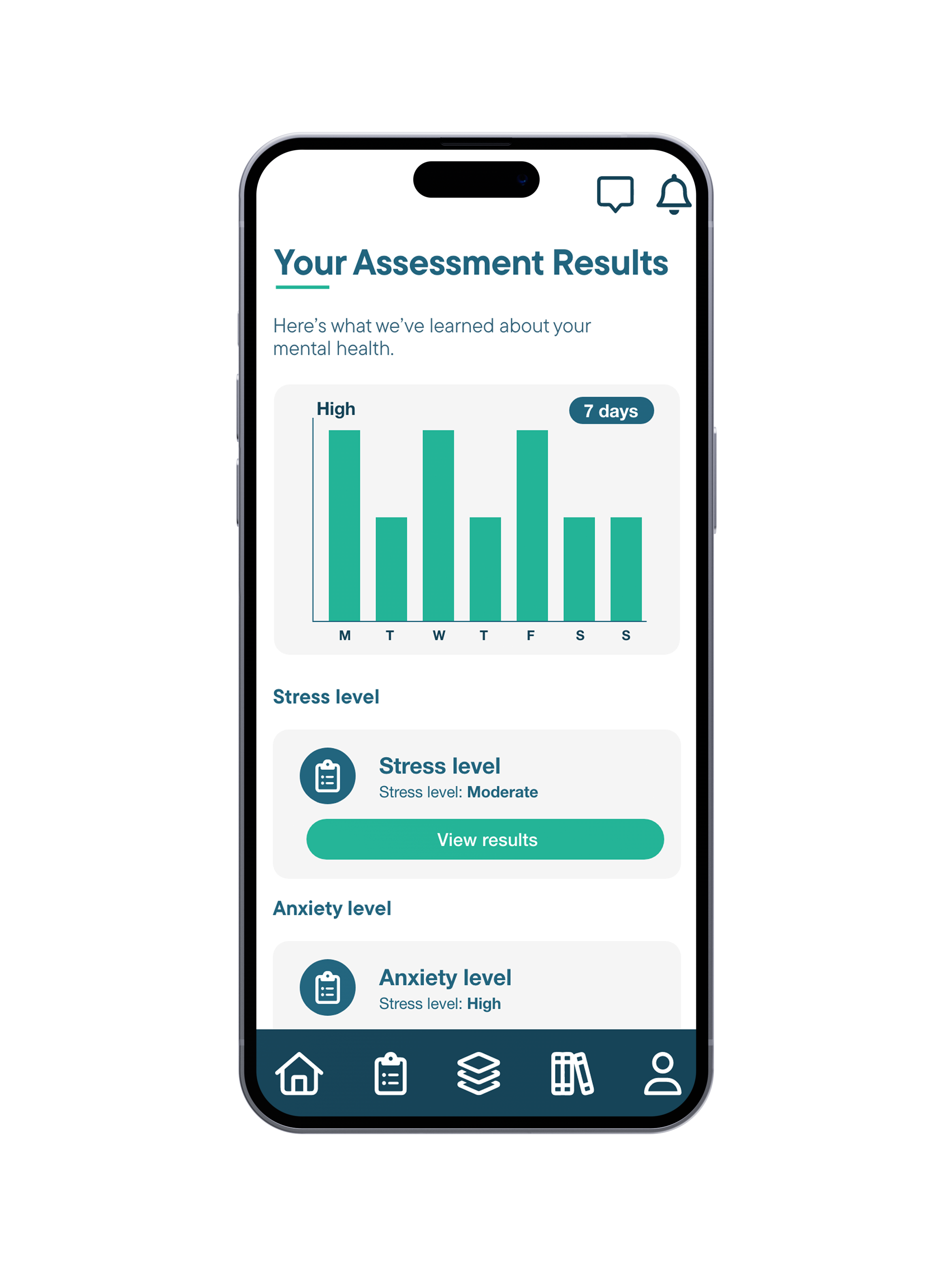
Mobile Application - Hi-fidelity designs